
Flex Wrap CSS Properties and Usage
The flex-wrap CSS property is used to set elements in a flex box to be compressed over multiple lines on the main-axis. The default value of flex-wrap:nowrap aligns elements in a single line in the direction of writing (row) or block-axis (column) according to the value of flex-direction by compressing the dimensions of the elements.
Changing the flex-wrap property value will wrap the items in a multi-line format inside the box without overflowing.
.container{flex-wrap: nowrap; } /* Default Value */
.container{flex-wrap: wrap; } /* Elements move to the bottom line or next line to avoid overflow. */
.container{flex-wrap: wrap-reverse; } /* Reverses items when items go to the bottom line or next line */
flex-wrap : Values
- flex-wrap: nowrap
- flex-wrap: wrap
- flex-wrap: wrap-reverse
1. flex-wrap : nowrap (Default)
flex-wrap:nowrap; With its value, the items in the flex box are always lined up in a single line. The dimensions of the items are also reduced to the maximum level as the flex box area gets smaller. At the point where it does not shrink, there will be an overflow from the flex box. flex-direction: row; flex-direction: column; The overflow will be in the direction of the block-axis (perpendicular to the typing axis) in a flex box with
.container{
display: flex;
flex-direction: row; /* Default Value */
flex-wrap : nowrap; /* Default Value */
}

In the picture above, the flex-direction value of the flexbox is row and the flex-wrap value is nowrap. In this way, the elements in the flexbox shrink to the point where they can shrink, and in this way there will be an overflow in the direction of writing.
2. flex-wrap: wrap
wrap; value will pass the items to a bottom line or a side line in order to keep the size of the items in the flexbox constant without reducing them.
.container{
display: flex;
flex-direction: row; /* Default Value */
flex-wrap : wrap;
}
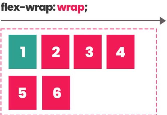
In the image above, items are wrapped in a container with the flex-wrap: wrap property, without trying to fit items on a single line.
3. wrap-reverse
flex-wrap: wrap-reverse; value behaves the same as wrap value. sorts items starting from the bottom row when items move to the bottom row.
.container{
display: flex;
flex-direction: row; /* Default Value */
flex-wrap : wrap-reverse;
}
The flex-direction value of the flexbox is row and the flex-wrap value is wrap-reverse. When the items go down to the bottom line, the order starts from the bottom end and proceeds towards the top line in the direction of writing.